It's time for another installation of Invitation 3 Ways with your favorite D&P Aussie. (I can make this bold claim as I'm the only Aussie around here.) This is my fifth time bringing you three fun ideas on how to style one invitation from our collection, so I feel I've really made it around here. I have my own regular column. So much so that I've started humming my own intro music in my head when I sit down to write these posts. It would be so awesome if I could get my off-key humming out of my head and into these articles, though I'd soon be downgraded from favorite Aussie to most annoying Aussie. I guess we'll keep going without the theme music.
I'm doing things a little differently today as I've chosen two different templates from one set. I've picked the invitation and menu from our French Damask collection, and I'll show you how to create three very different invitations. None of these styles are complicated to put together, though a little time and patience is going to go a long way.
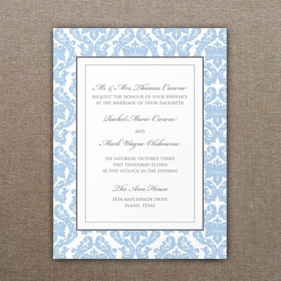
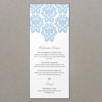
First, here is the invitation and menu as you see it in our product catalog.
Let me show you my little spin on things...
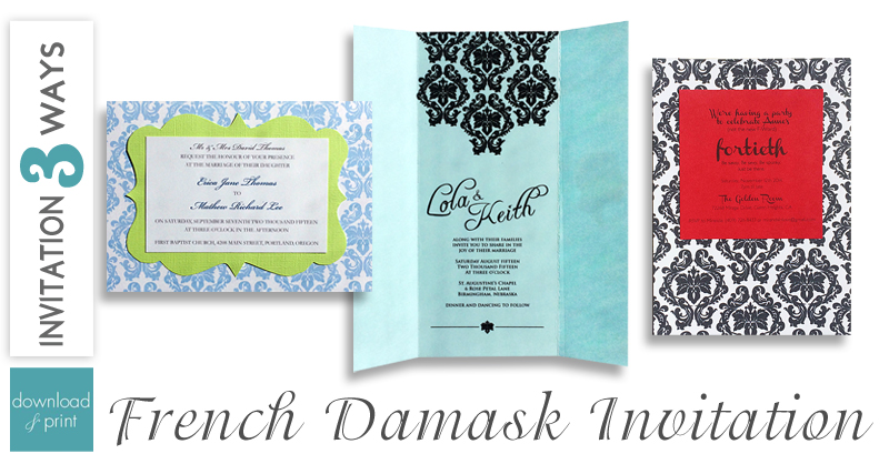
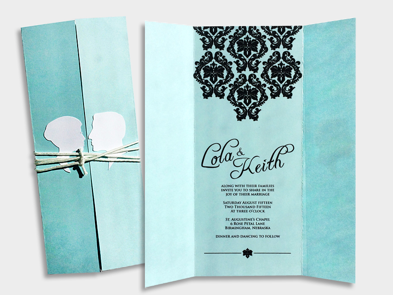
1. Tall with Cameo
I think this styling looks great and is quite easy to pull off. I used the menu template and changed the design color to black. (A little trick if you need to print the template ASAP and can't wait for us to change the color for you, is to print in black and white. You won't get a true black, the light blue will print gray, but it gives you options.) I chose the fonts Freebooter Script and Trajan Pro, and angled the names. If you use Word 2007 or earlier you can't rotate the text unfortunately. It took me a while to figure that out, so I'm passing along the tidbit so you don't stare at Word as long as I did trying to will the text to rotate! I also had to change the template to print one per page so I had enough room to include the flaps. I simply printed the template and trimmed to 7.5" wide. I scored the lines and folded in the flaps. Now for my favorite part of this look, I printed the cameo silhouettes on white paper and trimmed. I did hand trim these ones as I only needed one set, however if I were making all my wedding invitations I would find a paper punch of the two heads to make this step quick and easy. I stuck them to the outside of the flaps with double sided tape and wound white twine around the invitation to keep it closed. I love it!
2. Elegant Damask
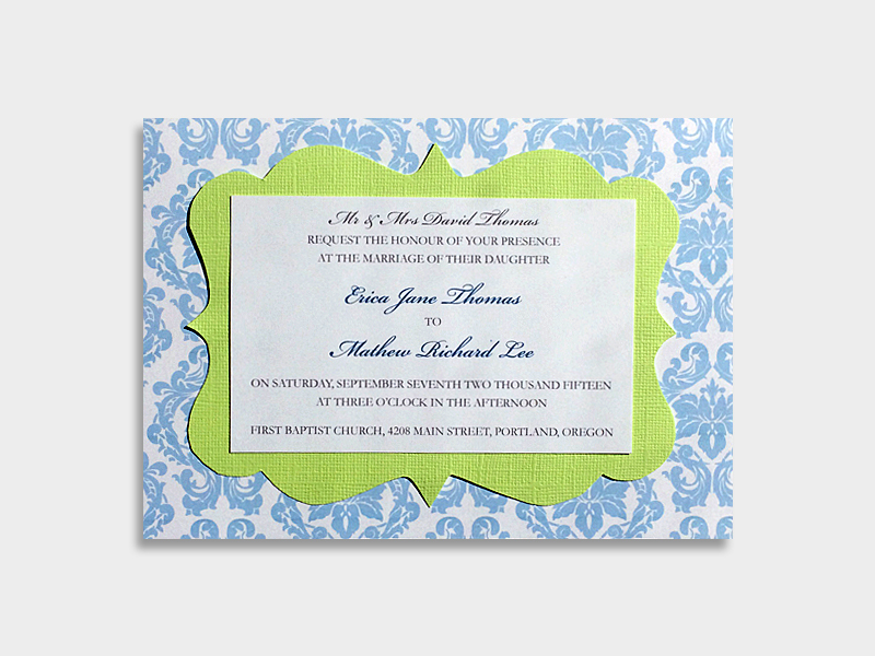
This style is definitely only for you that love to craft. Or at least love yielding a pair of scissors! I took the damask invitation from our catalog and flipped it sideways. The color blue is the same and I've left the text per the sample, using the fonts Bickham Script and Garamond. Instead of printing the text with the damask design I printed it on a separate sheet of paper. I also made a template from a frame design that Google helped me find, and cut this onto a sheet of green textured card. This I cut out by hand (I said you'd need to love using scissors). I layered the three pieces together with double sided tape for a classic invitation. My color choices aren't all that classic, but I like the way the playful colors work with the elegant damask print.
3. Sassy Damask
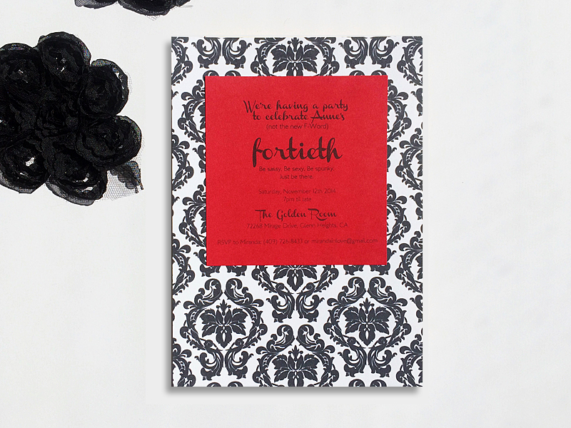
For style number three I turned the damask invitation into a sassy fortieth birthday invite. Black and red is always sassy, don't you think? I printed the damask design in black and white, and then printed the text on red card and cut to size. The fonts are Channel, a pretty sassy font I think, and LondonMM.
Don't forget to let me know in the comments which style is your favorite.

